Bootstrap
Bootstrap
CDN: 콘텐츠 전송 네트워크
컨테이너
컨테이너와 컨테이너 플루이드 차이 문제에 나옴
사이트 콘텐츠를 래핑하는 컨테이닝 요소가 필요할 때 선택할 수 있는 컨테이너 클래스는 두가지가 있다.
.container: 반응형 고정 너비 컨테이너를 제공.container-fluid: 클래스는 뷰포인트의 전체 너비에 걸쳐 전체 너비 컨테이너를 제공


Bootstrap Grid
그리드시스템은flexbox를 기반으로 구축되었으며 페이지 전체에 최대 12개의 열을 허용한다.
12개의 열을 모두 개별적으로 사용하고 싶지 않으면 열을 그룹화하여 더 넓은 열을 만들 수 있다.
Grid Classes
Bootstrap 5 그리드 시스템에는 6개의 클래스가 있습니다.
.col-(매우 작은 기기 - 화면 너비가 576px 미만).col-sm-(소형 기기 - 화면 너비가 576px 이상).col-md-(중간 장치 - 화면 너비가 768px 이상).col-lg-(대형 기기 - 화면 너비가 992px 이상).col-xl-(대형 기기 - 화면 너비가 1200px 이상).col-xxl-(xxlarge 장치 - 화면 너비가 1400px 이상)
위의 클래스를 결합하면 더욱 역동적이고 유연한 레이아웃을 만들 수 있습니다.
한 행을 보여주는 class row, col
<!DOCTYPE html>
<html lang="en">
<head>
  <title>Bootstrap Example</title>
  <meta charset="utf-8">
  <meta name="viewport" content="width=device-width, initial-scale=1">
  <link href="https://cdn.jsdelivr.net/npm/bootstrap@5.3.3/dist/css/bootstrap.min.css" rel="stylesheet">
  <script src="https://cdn.jsdelivr.net/npm/bootstrap@5.3.3/dist/js/bootstrap.bundle.min.js"></script>
</head>
<body>

<div class="container-fluid mt-3">
  <h1>Responsive Columns</h1>
  <p>Resize the browser window to see the effect.</p>
  <p>The columns will automatically stack on top of each other when the screen is less than 576px wide.</p>
  <div class="row">
    <div class="col-sm-1 p-1 bg-primary text-white">.col</div>
    <div class="col-sm-1 p-1 bg-dark text-white">.col</div>
    <div class="col-sm-5 p-5 bg-primary text-white">.col</div>
    <div class="col-sm-5 p-5 bg-dark text-white">.col</div>
  </div>
</div>

</body>
</html>

row안에 12개를 기준으로 채울 수 있다. p-N에서 N을 변경하면서 차지할 너비를 정한다.
타이포그래피
<!DOCTYPE html>
<html lang="en">
<head>
  <title>Bootstrap Example</title>
  <meta charset="utf-8">
  <meta name="viewport" content="width=device-width, initial-scale=1">
  <link href="https://cdn.jsdelivr.net/npm/bootstrap@5.3.3/dist/css/bootstrap.min.css" rel="stylesheet">
  <script src="https://cdn.jsdelivr.net/npm/bootstrap@5.3.3/dist/js/bootstrap.bundle.min.js"></script>
</head>
<body>

<div class="container mt-3">
  <p class="h1">h1 Bootstrap heading</p>
  <h1>나는 h1엘리먼트 입니다.</h1>
  <p class="h2">h2 Bootstrap heading</p>
  <p class="h3">h3 Bootstrap heading</p>
  <p class="h4">h4 Bootstrap heading</p>
  <p class="h5">h5 Bootstrap heading</p>
  <p class="h6">h6 Bootstrap heading</p>
</div>

</body>
</html>
class =”h1”을 사용해서 h1태그의 기능을 사용하고 있다.
대부분 그렇다.
마크
노란색 배경과 함께 형관펜 친것 처럼 하이라이트 주는 기능이다.
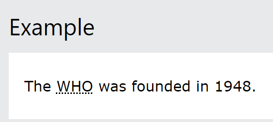
약어<dbbr>
위와 같이 점선이 그어지며 마우스를 가져다 대면 이에 대한 설명이 나온다
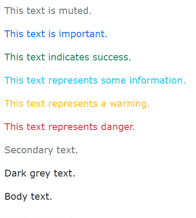
색상
- text 색상을 지정해서 보여주는 class들이 있다.
-
.text-muted,.text-primary,.text-success,.text-info,.text-warning,.text-danger,.text-secondary,.text-white,.text-dark,.text-body(default body color/often black) and.text-light
댓글남기기